Here’s another article by JD, courtesy of Peak Oil Debunked, providing some telling charts on the changes in oil consumption, which is not generally mentioned in talk about peak oil. Thank you, JD.
THE OTHER "PEAK OIL"
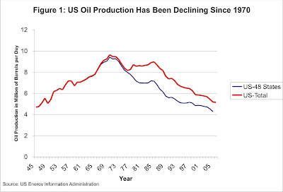
The peak oil community is obsessively focused on images like this. Peak graphs are presented for every country, like a slide show, and after viewing the whole series, you’re damn lucky if your eyeballs haven’t turned white and coagulated from raw anxiety.
But that’s just one side of the story. Today I’d like to show you a different series of peak oil graphs — the ugly stepsisters who don’t seem to get any attention. These are the graphs of peak oil consumption. Figures and images come from EIA country profiles. Take a deep breath, and fasten your seatbelt for a rude awakening to the realities of "peak oil".
Figure 2: Japan Oil Consumption Has Been Declining Since 1996
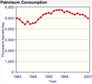
As you can see, "peak oil" occurred in 1996 in Japan — 12 years ago — and was an entirely demand-driven phenomenon.
Figure 3: Israel Oil Consumption Has Been Declining Since 2001
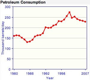
Wooh baby, that’ll turn your hair white… Israel "went over the cliff" in 2001, and is now down 16% from it’s peak level.
Figure 4: Germany Oil Consumption Has Been Declining Since 1998
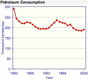
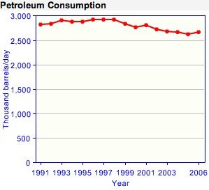 The decline of Denmark has an interesting dual-peak structure. It’s down 34% from its primary peak in 1980, and 20% from its secondary peak in 1996:
 Italy peaked in 1995 and is now down 14%:
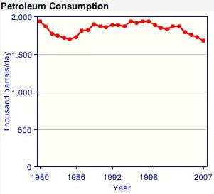 Savinar says a 10-15% drop will put your economy in the hospital — shatter the economy and reduce the population to poverty. Apparently Italy didn’t get the memo.
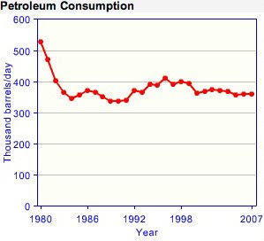
Sweden hit its final peak in 1996:
It’s such a shame because these graphs hold the important clues about peak oil. Yet they get almost none of the airplay. The fact that oil production will peak is just a truism — a statement of basic logic. The fact that a country can reduce it’s oil consumption without duress is like a miracle… something to really think about and learn from.


