Update from Allan on the market. He’s still buying puts on the S&P, it’s working for him. 
Something in the way it works
This market tested my faith Thursday morning when it gapped up and put my substantial short position in jeopardy. But I looked at my charts, my indicators, the patterns and wave counts we have been following for the past six months and said to myself, "Buy more puts." Which I did.
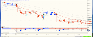
As Thursday’s trading unfolded, my faith in what I have come to rely on as a pretty damn good set of indicators was rewarded, as it has been so many times in this treacherous market. So my advice to all who wish to have success in trading remains: [click on charts for clearer view]
Sixty-Minute Elliott Wave Count (DJIA)
And here’s a little more from Allan’s analysis last night:
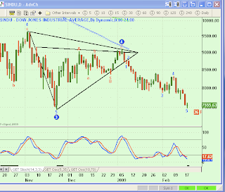
First out of the gate tonight is a Daily chart of the DJIA. I like this chart because it shows clearly where the market is coming from year-to-date and it incorporates a three-dimensional triangle (well, use your imagination for that third dimension) that has been decisively broken.

The above Daily chart shows that the entire year of 2009 has seen a descent out of a big wave 4 triangle ending the counter-trend rally from last November’s lows. Before moving on to our next chart, look at how well the FBS oscillator captured the decline with a Sell signal the first week of January.

Same Daily chart of the DOW, this time with a downward sloping channel superimposed on prices. Again, look at the Daily FBS and see the horizontal black line that is just now appearing on the screen. This is signifying a down-trend in progress.
So, where are prices going from here?
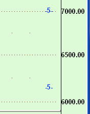
Below is my Advanced GET daily chart of the DJIA scrolled all the way down to where this program is suggesting prices are headed (on a daily chart):

Yes, that’s somewhere between 4500 and 6400 on the DJIA. How accurate is this program? Very. But it’s not perfect, especially when it comes to Fibonacci based projections. Nonetheless, we don’t seek perfection in trading, we seek probabilities and every chart above, every technique used on every chart above and every word of this blog is designed to exploit the probable and when all is said and done, these probabilities are screaming, "Down, down, down."
Note: Projections on the daily chart are lower than projections on the hourly chart, with overlap in the 6200 – 6400 range.


