Allan updates his technical analysis of the market with his usual variety of unique indicators and charts.
Respite, or utter collapse?
Courtesy of Allan

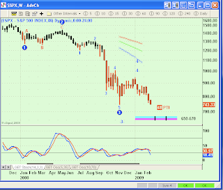
Above is the Weekly S&P chart. On it is placed a horizontal blue bar with two vertical black bars and the numbers 650-670 along side. That is where my EW software is suggesting the next level of market support lays. The vertical black bars are the weeks most likely to achieve that level.

The same tool drawn on the Daily chart gives similar levels for this part of the decline. Another 100 or so S&P points.

The above Sixty minute chart is the most bearish of the EW charts, suggesting we are in the midst of a 3rd Wave decline that seems to be targeting a minimum of 100 more S&P point decline, maybe much, much more. It is this chart that lends credence to fears that something nasty is about to befall Global markets, a no-place-to-hide financial disaster.
Oh yeah, the respite part. A week ago I introduced a Cycles generated road map that suggested a straight down market, which was spot on in its accuracy. One more time, clicking on the insignia above my name for the Foundation for the Study of Cycles, will bring up more information on these Cycle programs. Here is a current chart generated after today’s close:

The implication of this chart is that a cycle low is due the first week of March, followed by a one-week rally.
The one scenario that might satisfy all of this speculation is for a significant low to be put in place in the next couple of weeks, followed by a substantial rally.
How low and how much of a rally?
Stay tuned.


