Courtesy of Corey Rosenbloom at Afraid to Trade.com
So This is What Resistance Looks Like in SP500
If you ever wondered what it looked like inside a critical resistance level in the S&P 500, look no further than this post and the action of the past two trading days.
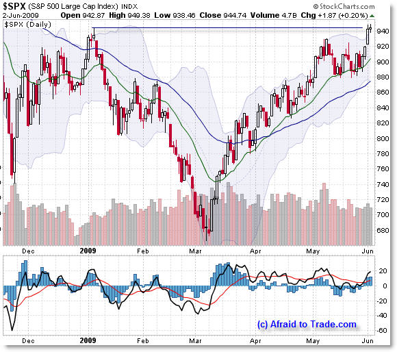
Let’s first look at the daily chart for the backdrop:

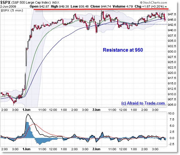
Bulls haven’t been able to push price above 950 – that could change suddenly in tomorrow’s trading, but for now, 950 is serving as important resistance which has formed a very interesting pattern on the lower-timeframes – almost reflecting a pure horizontal line just beneath this level.
Price managed to close right at the intraday January high which is mainly the only form of critical price resistance holding price back – bulls have already broken through lower-level Fibonacci confluences, EMAs, and the February swing highs.
Now, let’s step inside the chart to see the 5-minute price action to see key resistance at the 950 level and the massive consolidation that has formed.

You can almost feel it like steam trying to burst through a lid, or pressure building up that either will shatter this level… or fizzle out and fade away like mist.
It’s rare to see such a lengthy price consolidation at such a key level. Price already has already inched above a “Triple Confluence” level I mentioned previously at 940.
This post mainly serves as a point of interest, demonstrating how a higher timeframe can directly influence the behavior (support and resistance) of a lower timeframe, and why it’s important to know key technical price levels in advance if you trade mainly intraday.
Fascinating.
A reminder that I’ll be traveling to the Los Angeles Traders Expo (original blog post link) for my presentation on “Idealized Trades for the Intraday Trader“ which may be broadcast Saturday afternoon as a webinar – I’ll keep you posted on that but I’ll be networking this week and am looking forward to meeting blog readers at the conference!
Corey Rosenbloom, CMT
Afraid to Trade.com


