The Hidden Depression of the 2000s
 Courtesy of John B. Lounsbury
For several weeks I have been working on the analysis of economic activity from the point of view that, without some temporary, artificial and unsustainable factors, the U.S. would not have had the apparent prosperity during the years from 2002 to 2007. This article has resulted. However, rather than providing answers, I think this piece just raises more questions. I have come to realize that this is the start of a research process, not the culmination. I am indebted to private discussions with Seeking Alpha contributor Steve Hansen, who has helped clarify my thoughts about how much more needs to be done.
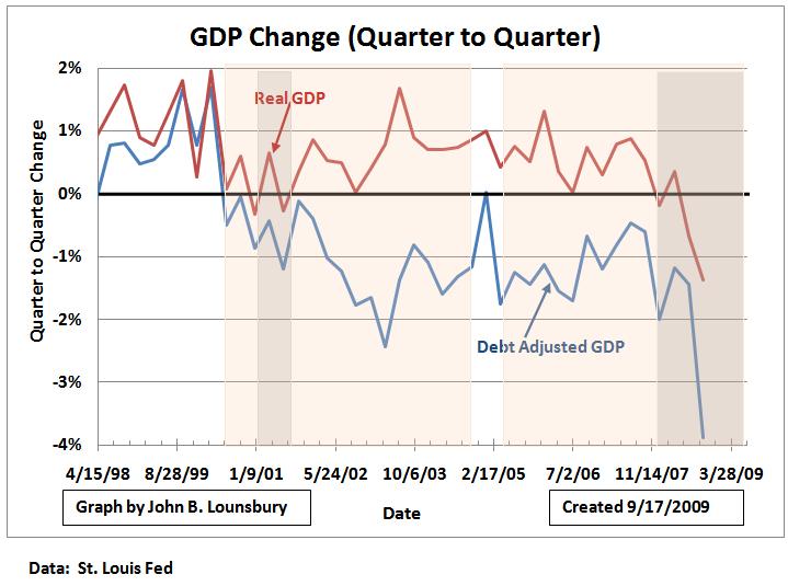
The U.S. has been living on borrowed time, literally. In the past several years we have run up federal deficits at a record rate. We have expanded commercial credit far more in proportion to growth of the economy than previously. We have also used rising home equity as personal piggy banks. If we had not taken these reckless actions, we would have been in almost continuous recession since the third quarter of 2000. There would have been only one quarter that did not have negative GDP growth and that quarter (first quarter 2005) would have seen 0.1% GDP growth.
The Rationale
I have focused on three expansions of debt. Let’s view the overall economic picture of the situation as a cash flow. I have identified three cash outflow items that have exceeded historical norms: federal deficits, commercial loans (which includes credit card debt) and net home equity withdrawals. I have identified one “cash” inflow item, GDP. This is not really cash inflow, but the cash value of economic activity measured under the GDP formula.
Clearly these (cash outflows and inflow) are not related through any cause and effect. Debt was not taken on for the purpose of purchasing GDP. But, if you consider the economy before the bursting of the dot.com bubble “normal”, then expenditures in excess of what occurred prior to 2000 should be considered in excess of normal.For the purpose of this analysis, I have subtracted the total of those excesses from the nominal GDP each year from 1998 through 2008. In other words, the basis of the analysis is that the national “wealth” was changed positively by GDP growth and diminished by debt incurred above the normal baseline.
I have identified four possible inaccuracies of my approach in Appendix I. There may be more factors that readers can identify. If this results, it will help my further efforts on this topic.
Even recognizing these potential inaccuracies in the analysis, I believe it does put us in the ballpark, if not actually on the pitcher’s mound. The four factors identified act in opposing directions (two would affect the adjustments to GDP positively and two negatively), but I do not want to try to estimate to what extent they might be self-cancelling.
Excess Commercial Credit
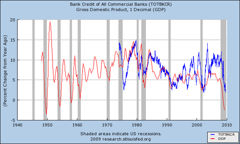
The following graph compares the growth of total commercial credit and nominal GDP.
The following table was prepared using the data from the above graph. It defines the “normal” level of commercial credit growth compared to GDP growth for the 27 years 1974-2000. It compares that to the higher commercial credit growth rate for 2001 through 2008.
For 2001-2008, growth of commercial credit above 0.4% per year was considered excess, an average of 2.9% per year.
Home Equity Extraction
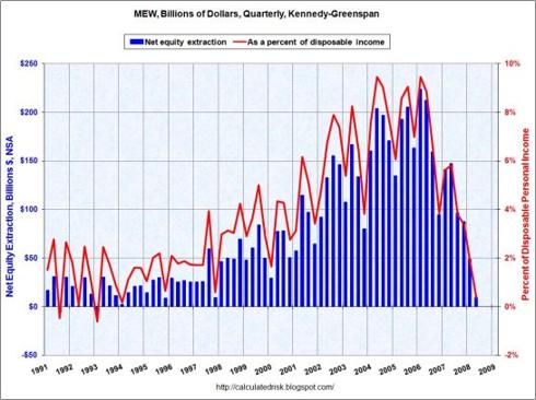
The home equity piggy bank was used to support higher consumption in the face of stagnant and declining incomes in the past several years. This was defined in a Federal Reserve Bank paper by Alan Greenspan and James Kennedy (here). The following graph was prepared by Calculated Risk Blog (here) from the Kennedy-Greenspan data.
For the five year period 2003-07, from 6% to 8% of disposable income was obtained from the home equity ATM. For most of the 1990s, this source was 1% or less of disposable income. With the collapse in home prices, this source of money essentially dried up by the middle of 2008.
Federal Deficits
The Federal deficits used in this analysis are the on-budget deficits, which ignore off-budget offsets, such as Social Security fund surpluses. These deficit numbers were obtained from the U.S Government Budget for 2010, Historical Tables (here). The annual deficits were divided into four equal parts for each quarter.
GDP Net of Excess Debt
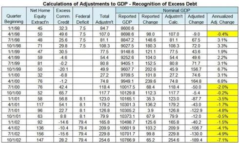
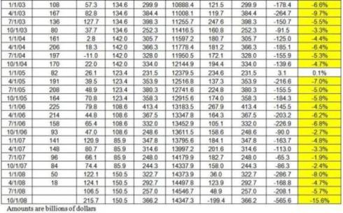
The data and results of calculation are given in the table in Appendix II.
The graph below compares the changes quarter to quarter for Real GDP and Nominal GDP adjusted downward by the amount of excess debt. The gray shaded areas indicate the official periods of recession. The pink shaded areas indicate the areas of negative adjusted GDP growth.
The Stock Market Peak of 1999-2001
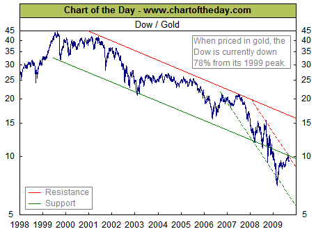
The most dramatic picture of the catastrophic decline in the U.S. stock market is shown in the following chart from www.chartoftheday.com . Charts could also have been drawn valuing U.S. stocks in a number of non- U.S. dollar currencies with similar, but less dramatic, declines. We have a depression-like stock market decline which has lasted more than ten years so far.
Depression of Personal Income
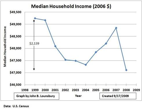
For the first time since the Great Depression we have a ten year time span with declining median income. From a 1999 high of $49,244 (2006 dollars), 2008 saw a 4.3% decline in median household income, as shown in the following graph.
Using the decline in payroll taxes as a guide, it can be anticipated that the median household income will have another significant year over year decline in 2009.
Note: The data displayed in the above graph was collected from three different U.S. Census Bureau sources and merged. This is described in Appendix III.
Depressed Employment
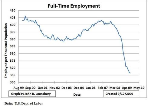
From an all-time high in April, 2006, full-time employment per capita has dropped approximately 10% in just over nine years. This is another depression-like economic parameter. There was an increase in full-time employment per capita 2004-2007, but it never regained the previous high. See the following graph.
Poverty
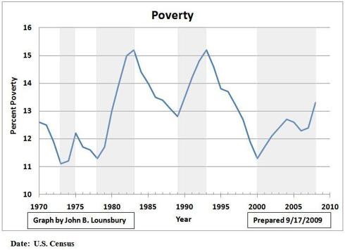
The years starting after 2000 and through 2008 constitute a period of time without a decrease in the poverty level of 0.5% or more. Only the “mini depression”, encompassing the 1980 and the 1981-82 recessions, has had a larger increase in poverty, but that increase spanned five years and this spans eight years so far. In the following graph, periods of rising poverty are shaded gray.
Conclusion
Whether you look at stock market values, personal income, poverty, employment, or GDP relative to newly acquired debt, we have had a depression for most of the early twenty-first century. It has been masked by unprecedented borrowing. Commercial credit and credit cards have been used at an unsustainable level. Home equity has been used like an ATM. Federal spending has been put on the tab. If you look at the U.S. as a black box, we have borrowed trillions of dollars, poured the money into a hole in the box, and gotten far less in value out the other side. That is what happens when you borrow for consumption, rather than for production. We have been on the mother of all consumption binges and now we have a colossal belly ache and hangover. How depressing!
Appendix I
There are four criticisms I can make of this analysis:
1. The implicit assumption is that, by subtracting a dollar of GDP for each dollar of “excess” credit, the two dollars are equal. In fact, in the past few decades a dollar of increased debt (total debt, not just the three categories included in this analysis) has correlated to much less than a dollar of increase in GDP. In fact, the effect of “excess debt” on our national wealth and GDP decline may be greater than assumed in this analysis.
2. The “normal” assumed for federal deficits is the near zero values of the late 1990s. If the baseline were to extend further back in time, “normal” could be some value (for annual deficits) larger than zero, but still far below the deficits since 2000. If this higher normal baseline for annual deficits were selected, the effect on GDP decline would be less.
3. The entire full value of net home equity withdrawal was assumed to be excess. It might be appropriate to define some low level of net home equity withdrawal as normal. If this were done the effect on adjusted GDP would be less negative.
4. The calculations were all done with nominal values (not adjusted for inflation). If they had been adjusted for inflation (to obtain the so-called real values), the GDP declines would have been greater.
Appendix II
The following table is presented as two images to fit image editing size restrictions.
Appendix III
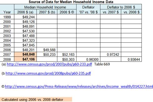
The median household income for the ten years 1999-2008 was obtained from three separate U.S. Census Bureau sources. These are shown in the following table, along with the deflators calculated from the data and the 2006 dollar values calculated for 2007 and 2008.
The active links are:
http://www.census.gov/prod/2007pubs/p60-233.pdf, table 669
http://www.census.gov/prod/2008pubs/p60-235.pdf
http://www.census.gov/Press-Release/www/releases/archives/income wealth/014227.html
For more by John Lounsbury, visit http://piedmonthudson.wordpress.com »
John B. Lounsbury Ph.D., CFP is a financial planner and investment advisor in Clayton, NC.


