Can We Really Trust The Leading Economic Indicators?
Courtesy of Mish
Leading economic indicators are soaring and inquiring minds are wondering if they signal a strong recovery is in the works. First let’s consider the Bullish case from the ECRI.
Please consider U.S. recovery ‘unlikely to falter’ anytime soon-ECRI
Oct 2 (Reuters) – An index of future U.S. economic growth slipped in the latest week, but its yearly growth rate climbed to a new record high, indicating a smooth recovery in the near-term, a research group said on Friday.
The Economic Cycle Research Institute, a New York-based independent forecasting group, said its Weekly Leading Index slipped to 127.1 in the week to Sept. 25 from an upwardly revised 127.9 the prior week, which was originally reported as 127.8.
Last week’s figure marked a 60-week high.
The index’s yearly growth rate rose to new all-time high of 25.1 percent in the latest reading from 24.3 percent the prior week.
"With WLI growth rising to yet another record high, the economic recovery is highly unlikely to falter in the next few months," said ECRI Managing Director Lakshman Achuthan.
Double Dip Recession Out Of The Question
In August the ECRI said U.S. double-dip recession "out of the question".
"With WLI growth continuing to surge through late summer, a double dip back into recession in the fourth quarter is simply out of the question," said ECRI Managing Director Lakshman Achuthan, reinstating the group’s recent warning to ignore negative analyst projections.
I would agree that a slip back into recession in the 4th quarter is unlikely, assuming of course it is even possible. Bear in mind, we have not had an official end of this recession declared yet.
However, putting such a short-term target on things while telling people to "ignore negative analyst projections" is quite a bit over the top.
Strongest Recovery Since Early 1980s
Also in August the ECRI declared US recovery may be strongest since early 1980s.
ECRI Says Inflation On Cusp Of Upswing
In October, the ECRI issued an inflation warning. Please consider US inflation on ‘cusp of cyclical upswing’.
Oct 2 (Reuters) – A monthly gauge of U.S. inflation pressures continued to rise in September to an 11-month high, suggesting an upswing in prices expected in an economic recovery, a research group said on Friday.
The Economic Cycle Research Institute’s U.S. Future Inflation Gauge (USFIG), designed to anticipate cyclical swings in the rate of inflation, rose to 90.6 in September from an upwardly revised 89.7 in August, which was originally reported at 89.6.
"The upturns in the USFIG and its components have become fairly pronounced, pervasive and persistent. Thus, while this is not yet a significant policy concern, U.S. inflation is on the cusp of a cyclical upswing," said Lakshman Achuthan, managing director at ECRI.
Cusp of Inflation?
I will gladly take the opposite side of the ECRI’s inflation warning.
Yield Curve As Of 2009-10-08
click on chart for sharper image
Since June the 3 month T-Bill has floated near zero, while the 10-Year Treasury Note yield has fallen from 4 to 3.17, a huge 83 basis points flattening of the curve. This is certainly not what one would expect to see on the "cusp of inflation".
Unfortunately we do not know the exact makeup of the ECRI’s WLI (Weekly Leading Indicator’s Index). After all they are selling a proprietary service.
However, we do know from the ECRI’s Business Cycle Glossary that the well-known monthly Index of Leading Economic Indicators (LEI), originally developed by ECRI’s founder, Geoffrey H. Moore, also oversaw the development of the WLI, which represents the latest in a long series of advances made since the introduction of the original LEI.
WLI is weekly while LEI is monthly.
Conference Board (LEI) Leading Economic Indicators
click on chart for sharper image
Please consider the latest (September 21) Conference Board release of Global Business Cycle Indicators
"Since reaching a peak in July 2007, the LEI fell for twenty months – the longest downtrend since the mid 1970s – but it has been rising since April and its gains have become very widespread," says Ataman Ozyildirim, Economist at The Conference Board. "The six-month growth rate of the LEI continues to accelerate. At the same time, the downtrend in the coincident economic index, measuring current economic activity, seems to be stabilizing, with the index flat so far this quarter."
Says Ken Goldstein, Economist at The Conference Board: "The LEI has risen for five consecutive months and the coincident economic index has stopped falling. Taken together, this suggests that the recession is bottoming out. These numbers are consistent with the view that after a very severe downturn, a recovery is very near. But, the intensity and pattern of that recovery is more uncertain."
Unlike the ECRI’s WLI, we do know the makeup of the Conference Board’s LEI.
Not Your Normal Leading Economic Indicator
Chris Puplava took a good hard look at the LEI in Fool Me Once, Shame on You. Fool Me Twice, Shame on Me.
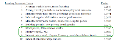
One of the things that many market commentators and research houses have pointed at to support their bullish outlook on the stock market are the leading economic indicators. I have had the sneaky suspicion that the aggressive and unprecedented actions on the part of the Fed have played a significant role in the LEI given a misleading signal as to an economic turnaround it is forecasting, while the economic components would likely paint a different picture. It is important to understand the makeup of the Conference Board’s Leading Economic Index (LEI) and the weights that each component makes up of the LEI. Below is the breakdown of the ten indicators that make up the LEI and their respective weights in the index. As seen below, the three financial indicators make up approximately 50% of the LEI while the seven economic components make up the other 50%, with the M2 money supply alone making up 35.8% of the total LEI. Money makes the world go round, I guess, according to the LEI.
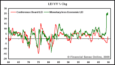
Shown below are the YOY rate of change growth rates in the Conference Board’s LEI and my indexes of the economic and monetary components separated out. What is a clear take away is that the monetary LEI is doing the heavy lifting as the economic LEI remains in negative territory.
What you can also see is that beginning in the 1980s the growth rate between the monetary and economic LEI began to show a greater disparity in their growth rates than they did in the 1970s. What this would tend to imply is that a greater level of monetary stimulus measures were needed to translate into improved economic growth rates. This aligns with the second chart below that shows the dollar increase in debt per dollar increase in GDP, which shows higher amounts of debt were needed to produce a dollar of GDP, and we are fast approaching the “Zero Hour” in which rising debt does not translate into increased economic growth, or the “pay the piper” moment for our economy.
Zero Hour – Debt Fails To Add To GDP
Further illustrating the notion that it is taking record stimulus just to keep growth going is the YOY growth rate difference between the Monetary LEI and the Economic LEI, with the disparity between the two growth rates at the highest level in the last half century.
The above charts simply illustrate that our economy is fundamentally weak and instead of allowing our economy to sober up after its debt binge, our monetary and governmental authorities are trying to keep the economy drunk and chugging along, using greater amounts of monetary alcohol than ever before.
There is much more in Chris’ article including a series of charts on consumer confidence numbers.
Inquiring minds will want to take a look.
M2 LEI
M2 is the highest weighted component in the LEI weighing in at a whopping 35.80%.
Interestingly the M2 annualized rate of return is falling rapidly and total bank credit is both negative and dropping like a rock.
M2 – Annualized Rate of Change
M2 is actually down since May-August due to the decline in the rate of growth of bank lending over the summer.
If the May-June rate of deceleration were to persist, M2 could conceivably start start contracting by year end or early ’10.
Total Bank Credit – Annualized Rate of Change
The above charts are from Competitive Currency Debasement – A Look at Rampant Monetary Expansion In China.
For a comparison of US monetary expansion vs. China, please click on the preceding link.
Weekly Hours Do Not Suggest Strength
The second largest component of the LEI is Average Weekly Manufacturing Hours, weighing in at 25.49 percent.
Inquiring minds are thus interested in Table B-2 of the BLS Monthly Employment Report.
Table B-2. Average weekly hours of production and nonsupervisory workers
click on chart for sharper image
For some reason the LEI is unconcerned with non-manufacturing hours at an anemic 33.0, down a tick since August and essentially going nowhere since May.
Manufacturing hours dropped from 39.9 to 39.8 month to month but reached 39.9 in July and August, up .4 from June. Temporary boost from Cash-For-Clunkers?
Payroll Hours Changes August To September (Major Categories)
- Total Private -.1
- Goods producing -.1
- Mining and Logging -.2
- Construction -.4
- Manufacturing -.1
- Durable Goods -.1
- Nondurable Goods -.1
That is the best we could do in spite of a ridiculous give away on Cash-For-Clunkers, and a free $8,000 down payment on homes, a trillion dollar deficit, numerous bailout programs, and the Fed expanding its balance sheet by trillions of dollars.
The third largest component of the LEI is the 10-year treasury bond less the Fed Funds Rate. That component has been sinking rapidly since May as the above chart on the yield curve shows (ie the 10-year treasury note has fallen 83 basis points while the Fed Funds Rate has been flat).
Somehow, the LEI is going up with manufacturing hours stalled, the yield curve flattening substantially, and the rate of change in M2 falling fast. Those three components make up 71.2% of the LEI.
If you think this makes little sense, you are not alone. Not only do I question the makeup of the LEI components, I question the conclusions based on the makeup as given.
Nonetheless, it is quite possible the LEI and WLI work quite fine in average recessions. There are probably many combination of weightings that would produce acceptable results. However, what I suspect but cannot prove, is the LEI or WLI criteria applied to data in 1930 would have shown something that did not happen: a big recovery was coming.
Bear in mind current conditions are closer to those that existed during the great depression than any time since.
Conceptually, I like Chris’ approach of separating out the monetary from the non-monetary leading indicators. The divergence is staggering. Let’s not mistake a false recovery in the financial sector for a true recovery in the real economy.
Finally, as I have pointed out many times, the Fed cannot force consumers to borrow or banks to lend. Without an increase in debt, it is highly unlikely for any kind of meaningful recovery. Moreover, given the problem is excess consumption and excess debt, we should not even be rooting for another borrowing binge to take place.


