Classic Market Bubble
Courtesy of John Lounsbury
The price to book ratio (P/B) is not a good valuation metric for individual stocks, because the price discounts future earnings and growth. A P/B ratio less than 1 for stock X with low earnings and no earnings growth does mean that stock X is undervalued. If stock Y, with P/B=2 has healthy and growing earnings, it may actually be undervalued and a much better buy than A.
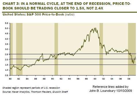
However, P/B does have value when assessing the relative valuation of indexes over time. To that extent, I found the following chart from David Rosenberg, Chief Economist at Gluskin Sheff, which I have modified as indicated.
Rosenberg suggests that the normal range for P/B ratios is between 1.5 and 2.4. The lower number is what is expected coming out of an economic trough and 2.4 is approximately the long-term average. By his analysis we have not had a P/B ratio consistent with economic reality since 1996. We came close on March 9 but quickly left that place.
Note: My reference lines are slightly above 1.5, 2.0 and 2.5 and are minimally above Rosenberg’s reference numbers.
Rosenberg also discusses other valuation measurements at length, including price to earnings ratios (P/E). Read his entire post here.
A graph such as this reinforces the opinion that some have regarding when equities in the U.S. really topped. Looking at this graph, one would say the market topped in 2000. The same conclusion is drawn when the market indices are priced in inflation adjusted dollars or gold. (See here.)
The inference from the Rosenberg graph is that one of the following conditions must pertain:
- We are well into recovery and should entering a maturing growth phase of the business cycle within a couple of years; or
- We are still declining from the 2000 market high and the current rally will have to give back substantial portions of the gains before long-term market growth can be maintained; or
- We are still declining from the 2000 market high and have not yet reached the bottom.
I give a greater than 50% probability to #2. The other two get much smaller probabilities: #1 Less than 10% and #3 less than 30%. (You can put the missing 10% into rounding errors. After all, guesses should have large rounding errors.)
The final thought I have from this chart is that it represents a classical picture of a bubble.
Disclosure: Currently short the S&P 500 with SDS.


