This is fascinating data that Phil brought to my attention. Richard Davis, President of the Consumer Metrics Institute, measures real-time consumer transactions as an objective indicator of consumer demand and associated economic health.
As Richard explains,
We simply report what consumers have been doing on a day by day basis by mining on-line U.S. consumer tracking data for purchases of discretionary durable goods. We only look for discretionary durable goods transactions because we believe the discretionary durable goods segment of the consumer economy is the most volatile and stimulative portion of the economy. Consequently, we are not capturing grocery or gasoline purchases; but we are, for example, collecting automotive and housing purchases. We divide the captured transactions daily into the following sectors of the consumer economy: automotive, entertainment, financial, health, household, housing, recreation, retail, technology and travel.
Additionally, we are aware that our sampling process may have some biases built into it because it uses the internet as the collection tool. For that reason, our consumers may have a different socioeconomic profile than the average American consumer. We are also collecting only U.S. originated transactions conducted in English. That said, however, we feel that our data does fairly represent the most variable parts of the consumer economy.
Because conclusions are only as accurate as the data from which they are drawn (but may be far less accurate), this approach is particularly intriguing. It is refreshingly free of government processing and alterations, such as confusing seasonal adjustments. Richard also wrote, concerning what his data is saying to him now:
We are not professional doom-sayers. We were incredibly upbeat one year ago — when most economic indicators were preaching doom and gloom. Since August, however, consumers have been pulling in their spending, and our numbers have slowly turned upside down. From our perspective on the demand side of the economy, a contraction is already here, having started officially in the middle of January. The only question now is whether the 2010 contraction will revisit 2006 or 2008? Our daily updates will ultimately tell the story.
Coincidentally, Richard is going to be speaking with Larry Doyle from Sense on Cents. You can catch the interview at 'No Quarter Radio' this Sunday at 8 pm ET.
For more, keep reading. – – Ilene
The 2010 Contraction Being Tracked by the Consumer Metrics Institute Traces Unique Pattern
Courtesy of Richard Davis at Consumer Metrics Institute
A new source of daily economic data shows that the 'demand' side of the economy has been shrinking at an annualized rate of over 1.5% during the trailing quarter. According to recent articles on www.commence.com, the new data, derived from millions of daily U.S. consumer internet transactions, recorded the trailing 91-days transitioning into net contraction on January 15th, 2010 after peaking at the end of August 2009. The contraction will flow down to the 'supply' side of the economy over the next few months, with the lagging GDP shrinking in the second quarter.
[Note – the following charts are updated daily and if you click on the chart, a new window should open with the most recent data included. – Ilene]
[Close up of the CMI’s Daily Growth Index over the last 60 days]
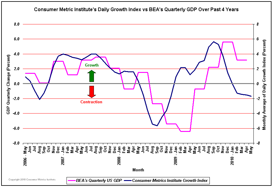
The data in the blue line in the chart is a revolutionary new daily source of spin-free hard data about the demand side of the economy. It does not involve any governmental sources. It does not utilize 'seasonal adjustments' (all numbers are year-over-year). It is simply based on real-time U.S. consumer transactions.
The current real-time consumer tracking data is showing contraction even as the latest GDP release indicates nearly 6% growth. The GDP lags by some 17 weeks both because it measures production activities 'downstream' from consumers and because the traditional data requires months to collect and adjust.
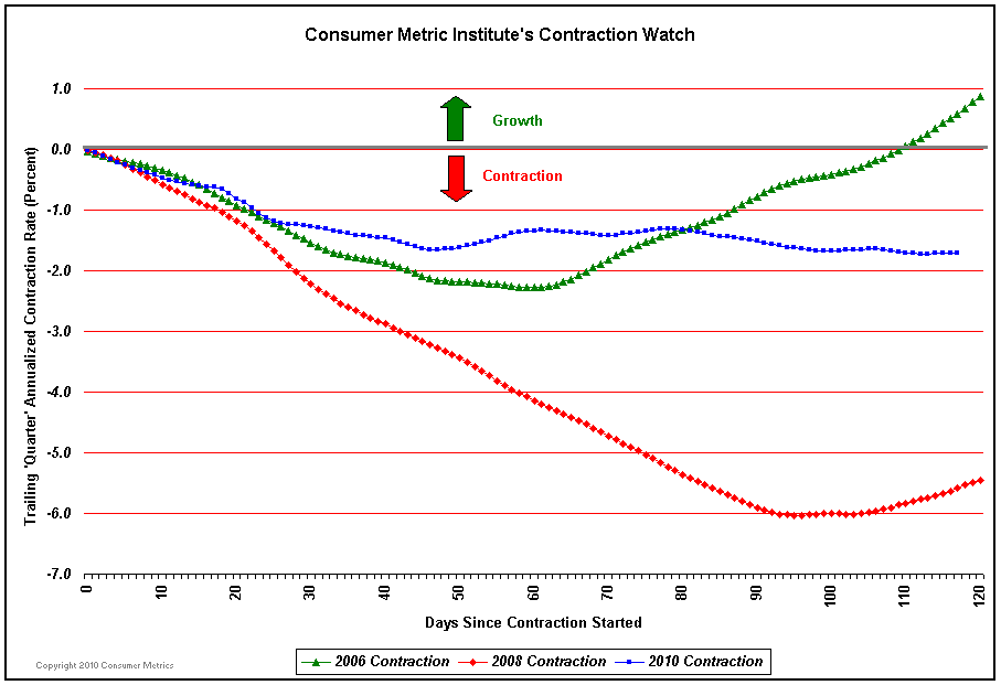
The most interesting data, however, is how the current contraction is unfolding. The two most recent prior contractions in 2006 and 2008 behaved very differently. The 2006 contraction (green) was mild and was ignored by the equity markets. The 2008 contraction (red) was neither. The 2010 contraction (blue) is tracking its own unique line on a day-by-day basis.
Although the downward movement of the 2010 contraction has flattened out, over the past few days it may have begun to show signs of resuming its decline. Unless the 'demand' side of the consumer economy picks up substantially over the next few weeks, the blue line on the graph will drift laterally to the right. If it continues to move in that direction it will be tracing a shape unlike either the mild 2006 or the catastrophic 2008 contractions, indicating instead a relatively shallow but persistent contraction consistent with the oxymoronic 'jobless recovery' that nearly everyone expects. Should the blue line remain in negative territory for the full quarter shown in the chart there will be a 'double dip' recession in the 'demand' side of the economy.
The Daily Growth Index is a very aggressive and preliminary indicator for a recession. At least, it is a sign that the much touted 'recovery' is not currently driven by enthusiastic consumers. We have always felt that consumers are not idiots and that they understand what they see going on around them. For that reason they are unlikely to start another spending spree until the 'jobless' part of the 'jobless recovery' clearly begins to subside.
The two weakest sectors the Institute monitors have recently been Housing and Retail. The Housing Index continued to bump along with a double-digit year-over-year shrinkage in consumer demand, with the Home Loans Sub-Index having shrunk to the lowest level recorded since September 2008. And by March 21st the Retail Index had returned to levels indicative of a greater than 6% year-over-year decrease in consumer demand. This number is substantially different from the self reported sales figures from the retail industry, which suffer from 'survivor bias' as a consequence of focusing on 'same store sales in stores open at least a year'. The closing of select stores or entire chains are simply unreported, while the traffic shifted to remaining stores generates a positive spin. The substantially more negative numbers reported by the Consumer Metrics Institute, however, have been matching sales tax collections, which have no survivor bias.


