The Ghosts of Lapsed Stimuli
Courtesy of Rick Davis at Consumer Metrics Institute
We have mentioned before that our year-over-year indexes are effected by both the current level of consumer activities and the year-ago levels of that same activity. Even if current levels remain dead flat, changing levels from the prior year can impact the year-over-year numbers. The bottom line, however, is that almost all economic measures ultimately use prior levels as reference points, and it is the annualized growth rates that we actually remember from the GDP reports.
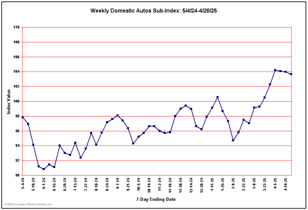
Nothing demonstrates this phenomenon more clearly than our Automotive Index, which experienced a tremendous upward spike at this time last year from the ‘cash for clunkers’ stimulus package. Looking back at the chart for that index from a couple of months ago the spike is glaringly obvious:
Now fast forward to the current chart, where the upward ‘blip’ from the consumer oriented stimulus has inexorably shifted to the left and is half off the chart:
There are several conclusions that can be drawn from the above chart:
- Some portion of the recent drop in our Domestic Autos Sub-Index is the result of current consumer demand comparing poorly year-over-year to the level of stimulated demand during the year-ago period.
- The historical portions of the chart clearly show that a consumer oriented stimulus can have a measurable effect on select sectors of the economy.
But, at least for domestic autos during this recovery:
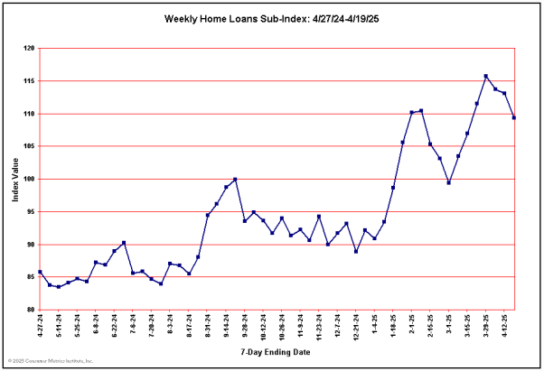
Without stimulus, significantly increased consumer demand has not been sustained. We see no signs of ‘organic’ or structural recovery yet in the either of two key durable goods sectors: Automotive and Housing:
The above chart is for the demand for new loans for newly acquired residential property (i.e., it excludes refinancing activities — which have remained strong). Again the impact of consumer oriented stimuli can be seen in the historical left side of the chart, but the right side tells us a great deal about whether the stimuli actually primed the Housing pump, or merely moved sales forward several quarters. If Housing is to become a real engine of economic growth again, this chart would have to move back into substantially positive territory and stay there without benefit of congressional give-aways.
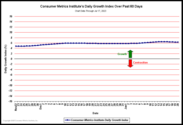
Our year-over-year ‘Daily Growth Index’ continues to decline, and we expect the year-over-year data to continue to suffer during August because of the now lapsed year-ago stimulus packages:

(Click on chart for fuller resolution)
The numbers that go with the above chart are not good. Our 91-Day trailing ‘quarter’ ‘Daily Growth Index’ has dropped to a contraction rate of more than 4.5%, while the 183-Day trailing ‘two quarters’ is contracting at a more than 3% rate. To put these numbers in perspective, less than 3% of all quarters since 1947 have had GDP ‘growth’ that was worse. Additionally, fewer than 3% of any two consecutive quarters of GDP ‘growth’ have been worse than our trailing six months. Ignoring 2008 for the moment, the past quarter by itself would be something we might expect only once in every 7 or 8 years.
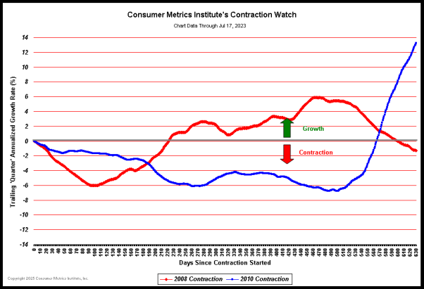
We have revised our popular Contraction Watch to simplify and extend the comparison to the two most critical contractions: the ‘Great Recession’ of 2008 and the 2010 event that we have been watching unfold on a day by day basis:

(Click on chart for fuller resolution)
The two contraction events charted in the above graph are depicted using identical year-over-year methodologies, so the chart presents a true apples-to-apples comparison between contractions. The severity of each event is the area between the event’s track and the gray ‘zero’ line, and the area of the 2010 event is now about half of the area traced by the 2008 episode. Clearly the ‘Great Recession’ of 2008 dropped to a more severe contraction rate than the current 2010 event. But the shape of the 2010 event remains troubling, with its daily level of contraction now having crossed the track of the ‘Great Recession’ event — meaning that at about 210 days the ‘Great Recession’ had already recovered to the point far above the day to day level we are experiencing now.
Looking at this chart we can also see that the ‘Great Recession’ had swung back into growth by 220 days, while the shape of the 2010 event indicates a probable duration that will be significantly longer. We may ultimately look back on 2008 as a relatively brief economic downturn that was a prelude to a much more prolonged event.
Note: A more complete list of historical commentary can be found on our History Page …


