Chris Kimble writes:
"Good morning…
I attempt to share ideas for longer-term and short-term investors. The attached chart might appeal to both."
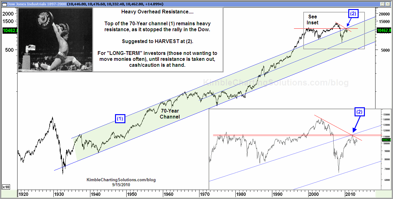
Here’s the chart of the Dow going back 70 years. It shows the Dow at the top of its resistance channel, which it has been above in the recent past. With 70 years of perspective, even a rather large drop in the market now would just look like reversion to the mean. – Ilene
click on chart to enlarge
For more charts by Chris, check out his blog: Kimble Charting Solutions.


