Courtesy of Mish
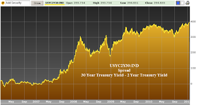
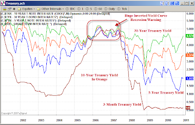
Curve Watchers Anonymous is watching the spread between 2-year treasuries and 30-year treasuries. Bloomberg reports "The spread between yields on the 30-year bond and the 2-year note marked the steepest slope in the yield curve since at least 1977, when regular offerings of long bonds began and Bloomberg started compiling the data."
Here are a few charts. Click on any chart below for a sharper image.
30-Year Minus 2-Year Treasury Spread
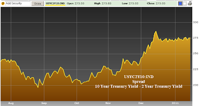
10-Year Minus 2-Year Treasury Spread
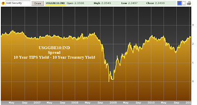
10-Year TIPS Minus 10-Year Treasury Spread
Bloomberg notes "Treasury Inflation Protected Securities showed traders’ expectations for price increases were near an eight-month high on speculation the Fed’s plan to buy bonds in a strategy called quantitative easing will facilitate faster growth."
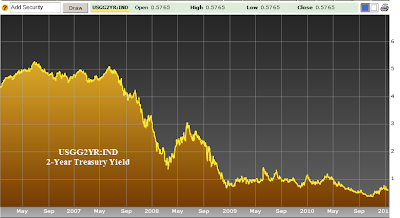
2-Year Treasury Yield
Yield Curve as of 2011-01-18
click on chart for sharper image
Symbols
- $IRX 03-Mo Treasury Yield
- $FVX 05-Yr Treasury Yield
- $TNX 10-Yr Treasury Yield
- $TYX 30-Yr Treasury Yield
The chart depicts monthly CLOSES of treasury yields. Unfortunately E-Signal does not have a symbol for 2-year treasuries. StockCharts does, but it cannot produce that chart.
The curve is artificially steep because Bernanke has the short end of the curve pegged near zero percent.
Bernanke’s announced intent for QEII was to lower interest rates.
QEII started at the beginning of November. Since that did not work (yields started spiking the day after the program started), Bernanke has proclaimed a rising stock market is proof of success of QEII.


