Courtesy of Mish.
Inquiring minds are digging still further into social security trends and costs.
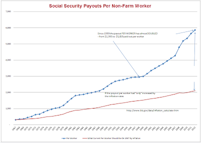
Here is a chart from Tim Wallace in response to my post Social Security Trends: Beneficiaries, Total Costs, Number of Workers, Ratio of Workers to Beneficiaries.
Social Security Burden on Non-Farm Workers
The line in red shows the expected trend if payouts had increased at the rate of inflation. Instead, escalating costs and the shrinking number of workers per beneficiary, has placed tremendous stress on workers ability to support beneficiaries.
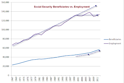
Here are a few of charts from the top link to highlight the reason for this trend.
Average Monthly Social Security Benefit
Social Security Beneficiaries vs. Total Non-Farm Employment
Ratio of Workers to Social Security Beneficiaries
…


