Courtesy of Mish.
In response to Interactive Map: Job Gains and Losses in the Recovery by Job Type (Healthcare, Education, Mining, Construction, Finance, Real Estate, etc), I exchanged Emails with Salil Mehta who has a blog on Statistical Ideas.
Salil asked for a better representation of some of the data in my post, specifically, a pair of tables I posted on jobs gains and losses since 2007.
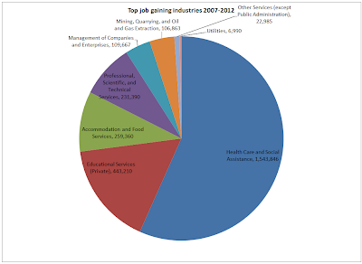
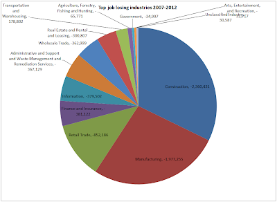
I put together a line chart of what Salil asked, but I like the pie charts he sent much better. Click on either chart to see a sharper image.
Job Gaining Industries 2007-2012
Job Losing Industries 2007-2012
Credit for the data itself goes to Economic Modeling Specialists.
2007 is December of 2007 (just as the recession started)
1012 is December of 2012 (the latest job data)
Job Winners
- Healthcare gained jobs every year since 2007, a total of 1,543,846
- Private Education Services gained every year since 2007, a total of 443,210
- Mining and Quarrying gained every year since 2007, a total of 106,863
…


