Courtesy of Lee Adler of the Wall Street Examiner
 The Labor Department reported that the seasonally adjusted (SA) representation of first time claims for unemployment fell by 5,000 to 330,000 from an unrevised 335,000 in the advance report for the week ended January 19, 2013.
The number was far better than the consensus median estimate of 355,000 reported by the financial news media. Seasonal adjustment remains a haphazard and arbitrary process that always yields a fictitious number. This week, for a second straight week, observers showed concern about the fact that the seasonally adjusted data may be misleading at the turn of the year. They are correct. The only problem is that they think the numbers will return to “normal” at the end of January. The problem, however, is not temporary. The SA number being fictitious, arbitrary, and haphazard is a permanent feature of the data. The pundits should recognize that that’s not just this week. It’s every week. It’s a charade.
The headline seasonally adjusted data is the only data the media reports but the Department of Labor (DOL) also reports the not seasonally adjusted data (NSA). The DOL said in today’s press release, “The advance number of actual initial claims under state programs, unadjusted, totaled 436,766 in the week ending January 19, a decrease of 119,944 from the previous week. There were 416,880 initial claims in the comparable week in 2012.” [Added emphasis mine] This year’s filings represented an increase of 5% over the referenced week last year versus an increase of 6% the prior week. However, the comparison to last year here is misleading as a result of calendar factors. The look back is 52 weeks. There’s always a drift of one day since a normal year has 52 weeks and a day. Last year was leap year, therefore a year ago would have been not January 19, but January 21.
Claims always peak in the first full week ended in January. This year, that was the week which ended on January 12. Last year it was the week ended January 7. Because the DOL’s ”year-to-year” comparison is actually made versus 52 weeks ago, not exactly a year ago, that’s a problem this year, partly due to the fact that last year was a leap year with 366 days or 52.29 weeks. Claims always fall sharply in the second and third complete weeks of January, whereas they always rise sharply the first full week. Therefore, comparing the January 12 week this year with the January 14, 2012 week was not an “apples to apples” comparison, nor is the following week. In this case, the “like” week for the January 12 week this year would be the one ended January 7, 2012. The government then compared the most recent week (January 19) with the week ended January 21 last year. The like week comparison for the week ended January 19 this year would be the one ended January 14, 2012. Comparing the week ended January 12 this year to the one ended January 7 last year, there was a drop of 89,000 claims, or -13.7%. Comparing the January 19, 2013 week with January 14, 2012, there was a drop of 119,000 or -16.7%. That’s consistent with the trend of this series for the past couple of years. In this context, this looks like a good number.
Note: The DOL specifically warns that this is an advance number and states that not seasonally adjusted numbers are the actual number of claimants from summed state claims data. The advance number is virtually always adjusted upward the following week because interstate claims from many states are not included in the advance number. The final number is usually 2,000 to 4,000 higher than the advance estimate. I adjust for this in analyzing the data.
I adjusted this week’s reported number up by 1,000, which is consistent with last week’s revision. The adjusted number that I used in the data calculations is 438,000, rounded.
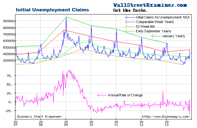
Note: To avoid the confusion inherent in the fictitious SA data, I analyze the actual numbers of claims (NSA). It is a simple matter to extract the trend from the actual data and compare the latest week’s actual performance to the trend, to last year, and to the average performance for the week over the prior 10 years. It’s easy to see graphically whether the trend is accelerating, decelerating, or about the same.
The week to week change of a decrease of 119,000 was not as good as usual for the second full week in January. Over the previous 10 years the comparable week has always had big declines. The average change for the 10 years from 2003 to 2012 was a decrease of approximately 167,000. In 2012 it was 121,000 and in 2011 it was 224,000, when the economy was in its bungee rebound from the extremely high levels of unemployment during the worst of the recession.
From mid 2010 through mid October 2012 the annual rate of change in initial claims had ranged from -3% to -20% every week, with a couple of temporary minor exceptions, including the Superstorm Sandy surge. Since mid 2011 the annual rate of change was within a couple of percent of -10% in most weeks. The trend was remarkably consistent.
A second trend has become visible on the annual rate of change graph (bottom of chart below). It shows a channel of slightly higher lows and higher highs indicating a slowing rate of improvement as the trend moved toward zero year to year change. The “like-to-like” week, annual rate of change of -16.7% is at the lower limit of these trends.
Normally, I would expect some moderation in the weeks and months ahead. Further reductions in the number of new claims should be much more difficult to achieve going forward. However, the Fed’s money printing may be stimulating bubble dynamics, which could cause growth rates to increase. The markets may cheer this, but it will be superficial, sustainable only as long as the Fed is able to sustain its money printing operations. That, in turn, will depend on inflationary pressures.
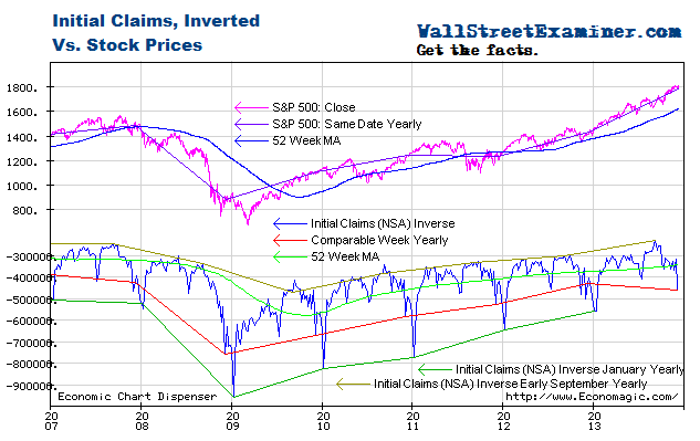
Plotted on an inverse scale, the correlation of the trend of claims with the trend of stock prices over the longer term is strong, while allowing for wide intermediate term swings in stock prices. Both trends are largely driven by the Fed’s operations with Primary Dealers (covered weekly in the Professional Edition Fed Report; See also The Conomy Game, a free report).
The chart below now suggests that the market trend is overbought at approximately 1500, assuming that the trend in claims remains relatively constant. This has been a long standing projection. Now that the market has reached this parameter, the question is whether additional Fed money printing will cause those trends to tilt more steeply upward. The year to year trendline in claims shows evidence of acceleration. If this acceleration is sustained in the weeks ahead, then stocks are likely to elevate their angle of ascent and break out through the trendline at 1500. Such a new trend may be angling toward 1600.
The expansion of QE means that the Fed’s balance sheet will now grow by a 38% annual rate, sending lots of cash toward and through the market with some of it trickling into the economy for the duration of the program. When the market became extended relative to the unemployment claims trend in 2011, the Fed was simultaneously ending QE2, thus starving the monster of its lifeblood. As a result the market pulled back sharply after reaching the top of the channel This year is different. The Fed is now intent on fattening the bull. That would allow the S&P to bump along the top of the channel as long as the jobs trend stays intact, or accelerate with an accelerating jobs trend.
Some bubble jobs will likely be created as the Fed pumps $85 billion per month net into the financial markets. However, the inflation that should accompany the money printing, whether in asset prices, commodities, or in consumer prices, should eventually force the Fed to stop QE. At that point the markets and economy will deal with the hangover from the program.
Get regular updates the machinations of the Fed, Treasury, Primary Dealers and foreign central banks in the US market, in the Fed Report in the Professional Edition, Money Liquidity, and Real Estate Package. Click this link to try WSE's Professional Edition risk free for 30 days!
Copyright © 2012 The Wall Street Examiner. All Rights Reserved. The above may be reposted with attribution and a prominent link to the Wall Street Examiner.


