Courtesy of Mish.
It’s easy to spot a Fed-sponsored housing bubble if you look in the right places. The best place to start is an analysis of price inflation as measured by the BLS as compared to a CPI-variant that takes actual housing prices into consideration instead of rent.
This is a followup to my post Dissecting the Fed-Sponsored Housing Bubble; HPI-CPI Revisited; Real Housing Prices; Price Inflation Higher than Fed Admits.
Data for the following charts is courtesy of Lender Processing Services(LPS), Specifically the LPS Home Price Index (HPI).
The charts were produced by Doug Short at Advisor Perspectives. Anecdotes on the charts in light blue are by me.
Background
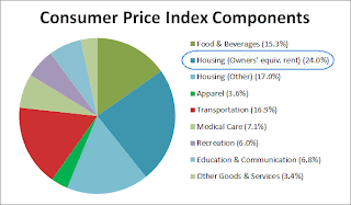
The CPI does not track home prices per se, rather the CPI uses a concept called “Owners’ Equivalent Rent” (OER) as a proxy for home prices.
The BLS determines OER from a measure of actual rental prices and also by asking homeowners the question “If someone were to rent your home today, how much do you think it would rent for monthly, unfurnished and without utilities?”
If you find that preposterous, I am sure you are not the only one. Regardless, rental prices are simply not a valid measure of home prices.
OER Weighting in CPI
click on any chart for sharper image
…


