Courtesy of Lee Adler of the Wall Street Examiner
First time claims stayed right on trend again this week but economists went back to underestimating the strength of the trend. They were too optimistic the week before. With the market now worried about Ben doing the QE Stomp, any good news on claims is now bad news for the market, especially with stock prices having gotten way over extended versus the improving trend in jobless claims. But should that matter?
The Labor Department reported that the seasonally adjusted (SA) representation of first time claims for unemployment fell by 23,000 to 340,000 from a revised 363,000 (was 360,000) in the advance report for the week ended May 18, 2013. The consensus estimate of economists of 348,000 for the SA headline number was too a little too high after missing on the low side last week.
Economists have been getting whipsawed lately as they try to adjust their forecasts based on the previous week’s number. It’s a ridiculous game, but everybody plays anyway. The irony is that the reporters frame it as the economy missing or beating the estimates. Ladies and gentlemen, the economy does not beat or miss. The economic forecasters are the ones who are guessing and missing, not the economy.
Why is the onus put on the economy to line up with the wild guesses of the economics priesthood? Why not focus on the fact that the consensus forecast is virtually never on the mark? Aside from the fact that economic forecasting is hocus pocus idol worship, the seasonally adjusted number, being made-up, is virtually impossible to consistently guess (see endnote). Even the actual numbers can’t be guessed to the degree of accuracy that the headline writers would have you believe is possible.
The headline seasonally adjusted data is the only data the media reports but the Department of Labor (DOL) also reports the actual data, not seasonally adjusted (NSA). The DOL said in today’s press release, “The advance number of actual initial claims under state programs, unadjusted, totaled 301,056 in the week ending May 18, a decrease of 19,767 from the previous week. There were 330,427 initial claims in the comparable week in 2012.” [Added emphasis mine]
The advance report is usually revised up by from 1,000 to 4,000 in the following week, when all interstate claims have been counted. Last week’s number was approximately 2,500 shy of the final number for that week released today. For purposes of this analysis, I adjusted this week’s reported number up by 2,500. The adjusted number that I used in the data calculations and charts for this week is 304,000 rounded. It won’t matter that it’s a thousand or two either way in the final count next week. The differences are essentially rounding errors, invisible on the chart.
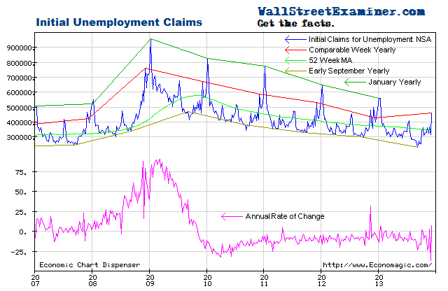
The actual filings last week represented a decrease of 8.1% versus the corresponding week last year. That’s a sharp improvement from the 1.3% drop the week before. Such volatility in the year to year comps is entirely normal. The average year to year improvement of the past 2 years of -8.8%, but the range is from near zero to -20%. The year to year comparisons are now much tougher as the number of job losses declined sharply between 2009 and 2012.
The current week to week change in the NSA number is a drop of 17,000. That compares with an average change of a decrease of 1,000 for the comparable week over the prior 10 years. The comparable week has had extreme variations with both increases and decreases. In 2012 the comparable week had an increase of 5,000, while in 2011 there was an increase of 15,000. The current weekly drop of 17,000 was the best reading since a jump of 29,000 in the comparable week of 2009, in the initial recoil from the pits of the recession.
Looking at the big picture, this week’s data is absolutely in line with the trend.
The Labor Department, using the usual statistical hocus pocus, applied seasonal adjustment factors ranging from about 1.17 to about 1.13 to the week corresponding to this one over the last 10 years. This week they applied a factor of 1.13.
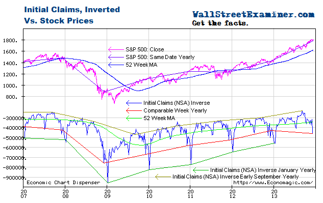
The correlation of the broad trends of claims with the trend of stock prices over the longer term is strong. It is most visible when the claims trend is plotted on an inverse scale with stock prices on a normal scale.
Stock prices were running with the initial claims trend until the Fed started QE3 and 4 late last year and early in 2013, causing the stock price rise to accelerate. In mid May, stocks reached maximum extension within the trend channel of the past two years. The Fed’s QE3-4 money printing campaign has had far more success in creating a stock market bubble, which was one of Bernanke’s stated goals (in slightly different words) than in driving economic growth. The selloff of the last two days notwithstanding, the stock market has appeared to be in parabolic blowoff mode as a result of the excess liquidity.
Meanwhile the trend of improvement in claims has slowed dramatically since the initial rebound in 2009 under QE 1. The improvement in the trend slowed under QE2 in 2010-11, and has slowed even more under QE3-4 beginning in late 2012. It’s clear that the latest massive round of money printing has done absolutely nothing to spur this measure of the economy. This is not an anomaly. The same result shows up in the broad spectrum of economic indicators. QE has failed. The Fed’s solution has been to do more of it, which has only served to drive the bubble in stock prices higher.
There’s plenty of room for a deep pullback in stock prices, but there’s also a chance that stock prices will decouple completely from economic indicators as long as the Fed ( joined by the BoJ) keeps cashing out the Primary Dealers every month via its asset purchase programs (QE3-4). Bernanke and his sycophants have sown tremendous confusion about when they will end QE, and the market got very skittish about it yesterday and today. But I’m a believer that money talks and bullshit walks. The Fed’s talk and the media’s interpretation of it is a constant stream of unmitigated bullshit. Follow the money.
Note: There is no way to know whether the SA number is misleading or a reasonably accurate representation of the trend unless we are also looking at charts of the actual data. And if we look at the actual data using the tools of technical analysis to view the trend, then there’s no reason to be looking at a bunch of made up crap, which is what the seasonally adjusted data is. Seasonal adjustment just confuses the issue.
Seasonally adjusted numbers are fictional and are not finalized until 5 years after the fact. There are annual revisions that attempt to accurately reflect what actually happened this week. The weekly numbers are essentially worthless for comparative analytical purposes because they are so noisy. Seasonally adjusted noise is still noise. It’s just smoother. So economists are fishing in the dark for a fictitious number that is all but impossible to guess. But when they are persistently wrong in one direction, it shows that their models have a bias. Since the third quarter of 2012, with a few exceptions it has appeared that a pessimism bias was built in to their estimates.
To avoid the confusion inherent in the fictitious SA data, I work with only the actual, not seasonally adjusted (NSA) data. It is a simple matter to extract the trend from the actual data and compare the latest week’s actual performance to the trend, to last year, and to the average performance for the week over the prior 10 years. It’s easy to see graphically whether the trend is accelerating, decelerating, or about the same.
The advance number for the most recent week is normally a little short of the final number the week after the advance report, because the advance number does not include all interstate claims. The revisions are minor and consistent however, so it is easy to adjust for them. Unlike the SA data, after the second week, they are never subsequently revised.
Read When They Do The QE Stomp
Get regular updates the machinations of the Fed, Treasury, Primary Dealers and foreign central banks in the US market, in the Fed Report in the Professional Edition, Money Liquidity, and Real Estate Package. Click this link to try WSE's Professional Edition risk free for 30 days!
Copyright © 2012 The Wall Street Examiner. All Rights Reserved. The above may be reposted with attribution and a prominent link to the Wall Street Examiner.


