Courtesy of Mish.
As we face retirement sunset demographics, inquiring minds might be wondering how many people are left to foot the bill for retiree Medicare, health care, public union pensions, and Social Security promises vs. the number of people collecting benefits.
The following charts from reader Tim Wallace will help put things into perspective.
Employment vs. Population

click on any chart for sharper image
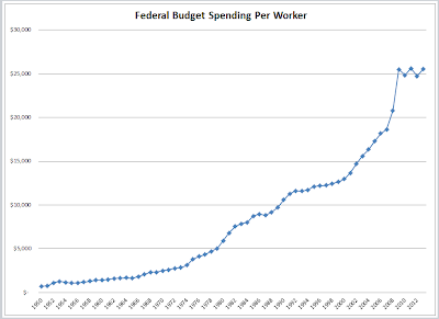
Federal Spending Per Worker
The above chart is just federal spending. It does not include state and local pension promises or healthcare costs
If you think promises made cannot possibly be kept, even with huge tax hikes, you are thinking correctly.
Mike “Mish” Shedlock
http://globaleconomicanalysis.blogspot.com


