

Russell Breaks Down, Negative Divergence in NYSE New Highs
That said, Peter Boockvar tells an important story here with both the NYSE internals and the technical picture for the Russell 2000 small cap index:
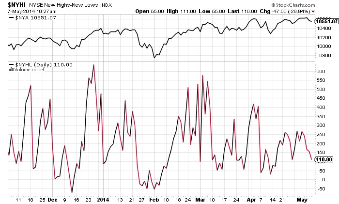
Yesterday the Russell 2000 closed below its 200 day moving average for the first time since November 2012. Over the past few weeks it has traded below intraday but always found the buyers on the dip to save the day. This may be a meaningless one day event but I highlight this because if it’s not, it will have broader implications possibly for the rest of the market in terms of the big picture technical’s. To further highlight the growing divergences in the market, Monday’s close in the S&P 500 was just 6 pts from the all time record high close on April 2nd. But, on April 2nd 187 NYSE stocks reached 52 week highs vs 76 on Monday. On December 31st with the S&P 500 close of about 1850, there were 282 stocks closing at 52 week highs. Also, just 65% of NYSE stocks closed above their 200 day moving average on Monday vs 74% on April 2nd and 74% on December 31st.
Josh here – I’ve created the below chart to illustrate what Peter’s talking about. In the top pane you’re seeing he NYSE Composite’s price, teetering just below recent highs. In the larger pane below, a simple line chart of New Highs subtracting New Lows. You can see this ratio dropping off, diverging from the new highs in index price. No es bueno.
Now here’s the Russell 2000 index price chart (top pane), with a ratio chart of the IWM to SPY – small cap ETF vs large cap ETF in other words. In price terms, the small caps are back to their February lows. In ratio terms, they’re lagging the broader market substantially, which sets up a fairly ugly non-confirmation of large cap highs.
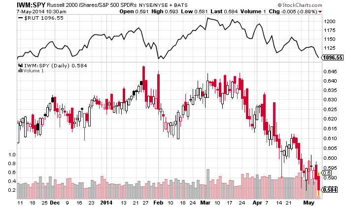
You don’t typically want to see large caps struggling at recent highs with less underlying participation by individual stocks – narrowing of participation at highs is how tops are formed. You also don’t typically want to see new all-time highs for the S&P while the more economically sensitive small caps are in a correction. These things can resolve in either direction, but the historical bias is toward a resolution to the downside.
Source:
Peter Boockvar
Managing Director and Chief Market Analyst
The Lindsey Group
UPDATED:
Check out JC’s take at All Star Charts