Chart o’ the Day: Here Comes the Seasonal Tailwind
Courtesy of Joshua M Brown
The other day I covered this subject but I think it’s worth reprising – the best six months are now upon us and, unlike many other seasonals / cyclicals that are an exercise in intensive data-mining, this is a study that has an extraordinary amount of validity in my opinion.
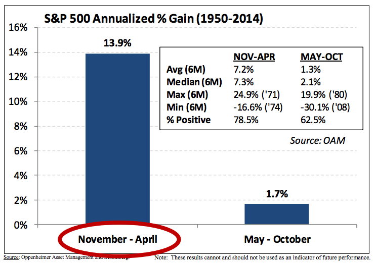
Ari Wald, ace technical analyst at Oppenheimer, posts a simple table illustrating the annualized returns of investing ahead of the best six months versus the lesser of the two periods going back decades…
Seasonal trends are a tailwind for S&P 500 performance.
In fact, since 1950, the S&P 500 has averaged an annualized gain of 13.9% between November and April vs. a 1.7% annualized gain between May and October. In addition, the index has been higher between November and April 78.5% of the time vs. 62.5% of the time between May and October.The best November-April performance occurred in 1971 (+24.9%), and the worst occurred in 1974 (-16.6%).
Source:
Technical Analysis: Inflection Points
Oppenheimer Asset Management – November 10th 2014
Read Also:


