Are stocks and housing off on another bubble?
Courtesy of James Hamilton of Econbrowser
As a new year gets under way [Nobel Laureate Robert] Shiller fears that advanced economies could be on the cusp of another stock market and property bubble that could end in tears….
“I’ve tried to inquire why we are having these booms right now at a time of so-called secular stagnation with low interest rates, and arrived at the thought that low interest rates are promoting these bubbles.”
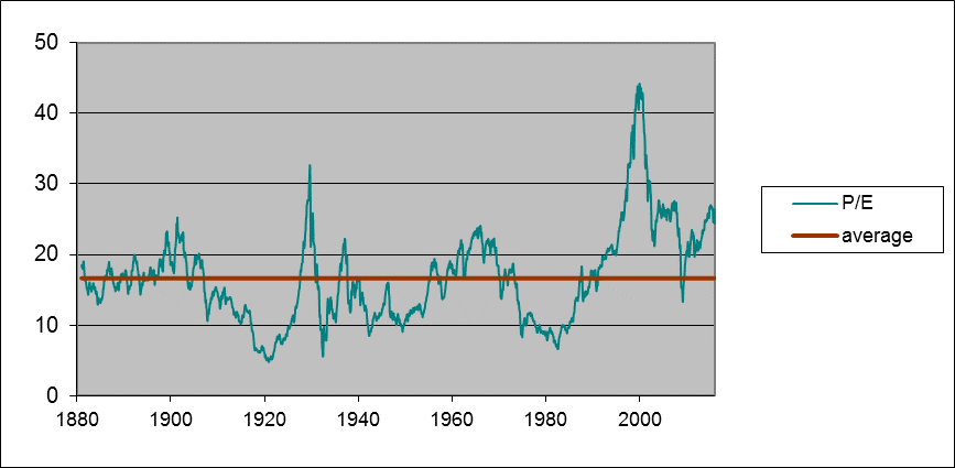
One of Professor Shiller’s academic contributions was construction of a monthly time series analogous to the current S&P 500 stock price index along with dividends and earnings going all the way back to 1871. One summary he has used for how expensive stocks are at any point in time is the ratio of the inflation-adjusted value of stocks in month t to the average real earnings on those stocks over the previous decade, with the averaging helping to standardize the measured P/E with respect to business-cycle fluctuations. The current value of that backward-looking P/E (even with last week’s stock market losses) is 24.4, well above the historical average of 16.6.

Green line: Ratio of real value of composite stock index to the arithmetic average value of real earnings over the previous decade, January 1881 to January 2016. Red line: historical average (16.65). Data source: Robert Shiller.
The way we’ve usually seen a high P/E return to the historical average is through subsequent below-normal growth of stock prices (that is, by lowering the numerator in the price/earnings ratio). Between 1881 and 2005, if you bought stocks in a month when the P/E was 25 or higher, your average annual real capital gain from holding stocks over the next decade would only be 1.2%. In a third of those months, the real value of the stocks would actually turn out to be lower after holding them for ten years than what you paid.

Each circle represents a month between 1881 and 2005. The horizontal axis is the P/E for that month, and the vertical axis is the compound return at an annual rate (excluding dividends) if you bought the stock in that month and sold it ten years later. Also plotted is the regression line return = 9.37 – 0.305*pe, whose coefficient on pe has a Newey-West 200-lag t-statistic of -2.9.
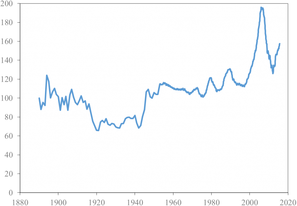
Another useful series that Shiller developed is an index of the real value of U.S. homes going back to 1890. For about a century, house prices in Shiller’s estimates rose on average at about the same rate as other prices, leaving the real value of the index in 1975 about where it had been in 1890. The house price bubble of 2000-2005 is a pretty dramatic outlier from that historical stability, and was followed by a spectacular crash that returned the index in the neighborhood of the historical norm by 2012. But since then U.S. house prices have once again been significantly outpacing inflation, with the index now back up to 157.

Real index of U.S. house prices, 1890-2015. Source: Robert Shiller.
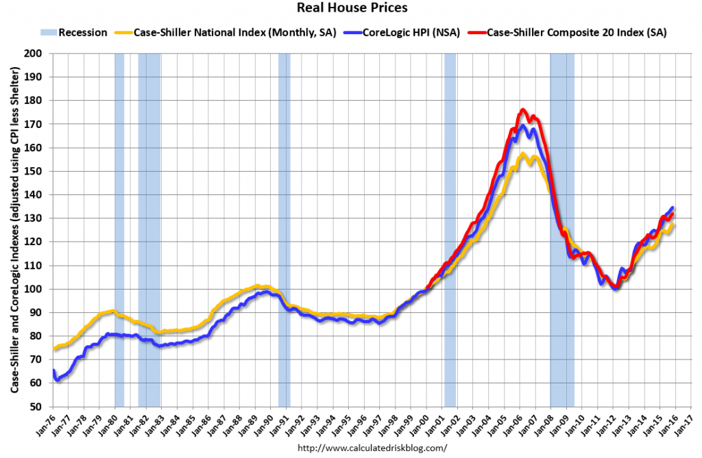
Although Shiller’s estimates imply that U.S. house prices did not rise in real terms over 1890-1975, economic theory would suggest that at least the real value of the land component of house prices, being a fixed irreproducible asset, should grow at the same rate as real GDP. Even so, the 2015 price still looks like something of an anomaly on the above graph. Here’s more detailed recent data based on the Case-Shiller and CoreLogic house price indexes. For both of these the recent values still look higher than one would have expected on the basis of simple trend projection.

Source: Calculated Risk.
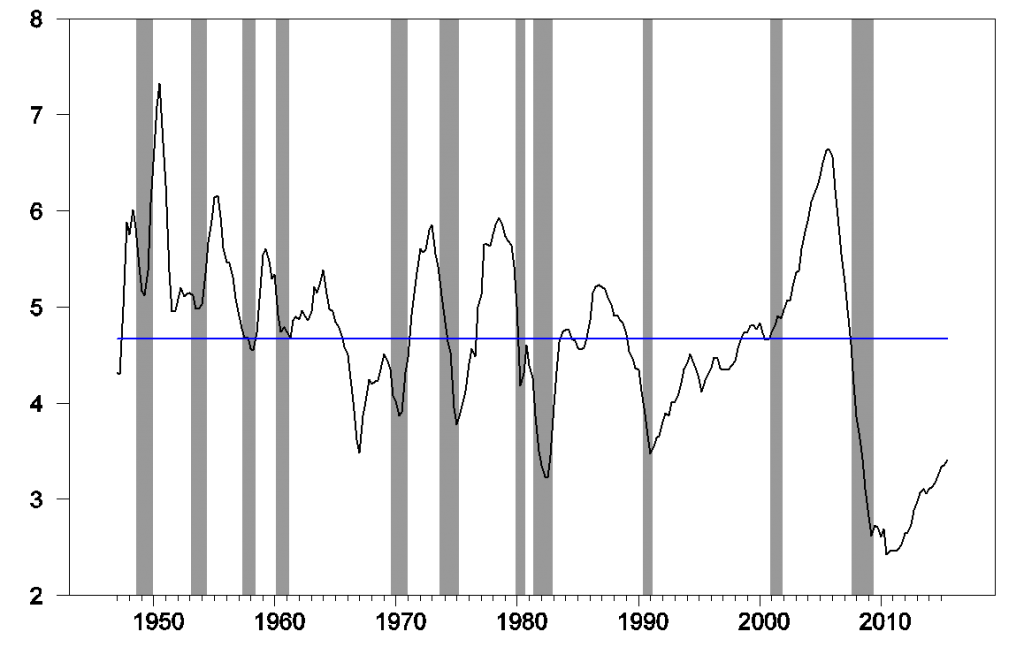
To some extent the elevated prices of equities and homes are not because investors believe prices can only go up but instead because the return on any asset right now is so low. You might well have to accept the low expected return available today on a stock investment that is implied by the regression line in the second figure above just because there is nothing else better. Another important difference between today and the early 2000’s is that although house prices have been climbing, there’s no indication of anything remotely like a bubble in terms of new home construction. Residential fixed investment in 2015:Q3 was only 3.4% of GDP, well below the historical average of 4.7%.
So I don’t think it’s accurate to say that the Fed today is committing an error akin to fueling the dot-com bubble of the late 1990s or the housing bubble of the early 2000s. Nevertheless, this long-run perspective is certainly something that the Federal Reserve (and individual investors) need to keep in mind. Last week’s correction in stock prices should serve as a reminder of the vulnerability that is inherent in current asset valuations.


