Chart o’ the Day: The Tech Breakout Nobody’s Talking About
Courtesy of Joshua M Brown
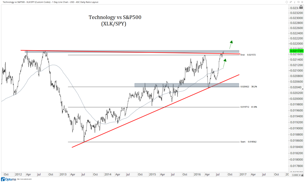
My pal JC Parets at All Star Charts has a pair of worthwhile charts to check out concerning the recent strength in large cap tech. It’s not just tech on an absolute basis – it’s tech relative to the overall markets that is most interesting to him.
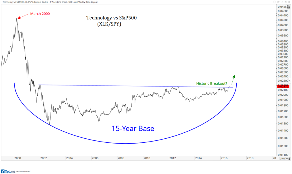
After the March 2000 crash, the implications are a long time of rebuilding, particularly on a relative basis. We’ve seen this in financials since 2008.
But Tech has gone 15 years, not just 7 (like financials).
We are now breaking out of a monster base in Tech relative to S&Ps. If this is for real, I can’t think of anything more bullish for U.S. equities
(Tech is 21% of the S&P500, see weekly and daily charts of XLK/SPY)
His first chart is a ratio chart of the S&P 500 Technology Sector vs the S&P 500, recently. A breakout appears to be at hand…
Next, the long view. Have a peek at that base he’s talking about…
If you’re into these sorts of insights, visit All Star Charts for more information:


