Happy Holidays!
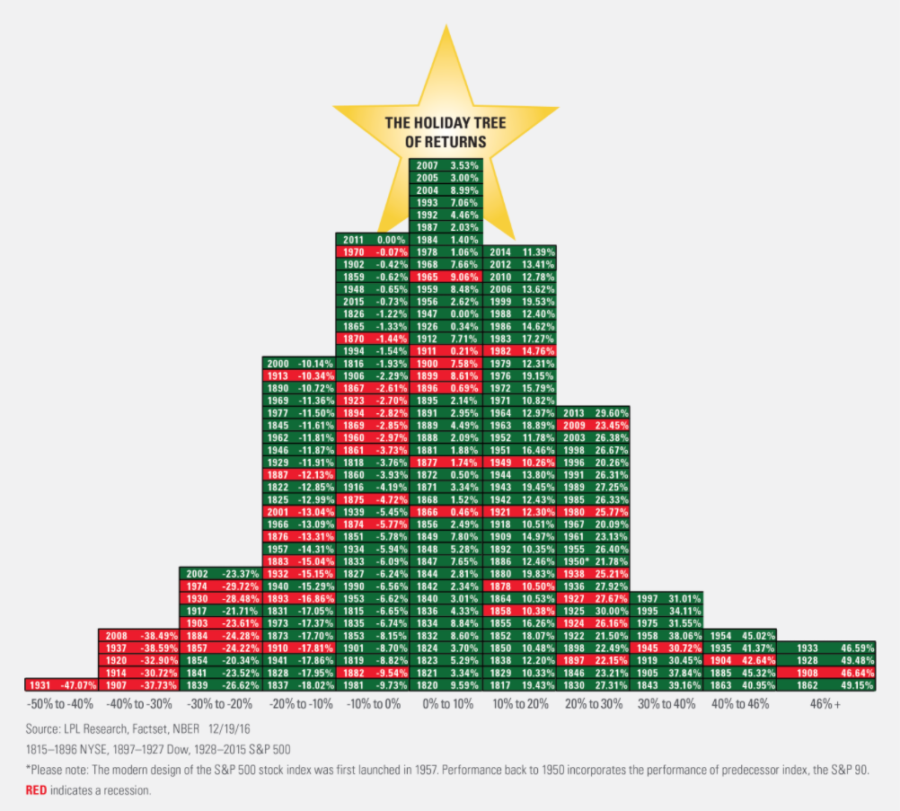
Chart o’ the Day: The Tree of Stock Market Returns
Courtesy of Joshua Brown, The Reformed Broker
My buddy Ryan Detrick shared the below at LPL Research and I wanted to make sure you’d seen it.
An illustration like this makes you wonder why so many people choose to focus obsess on the incidences of negative returns in a given year (boxes left of center). The red boxes don’t represent negative years for stocks, just years in which a recession occurred. You’ll be surprised to find some green years (economic growth) having down-stock market performance and some red years with gains. It’s counterintuitive but so is a lot about the interplay between markets and economics.
Click to embiggen this bad boy:
Source:
Long-Term Look At Recessions And Returns (LPL Research)


